
CADO
UX Design, UX Research
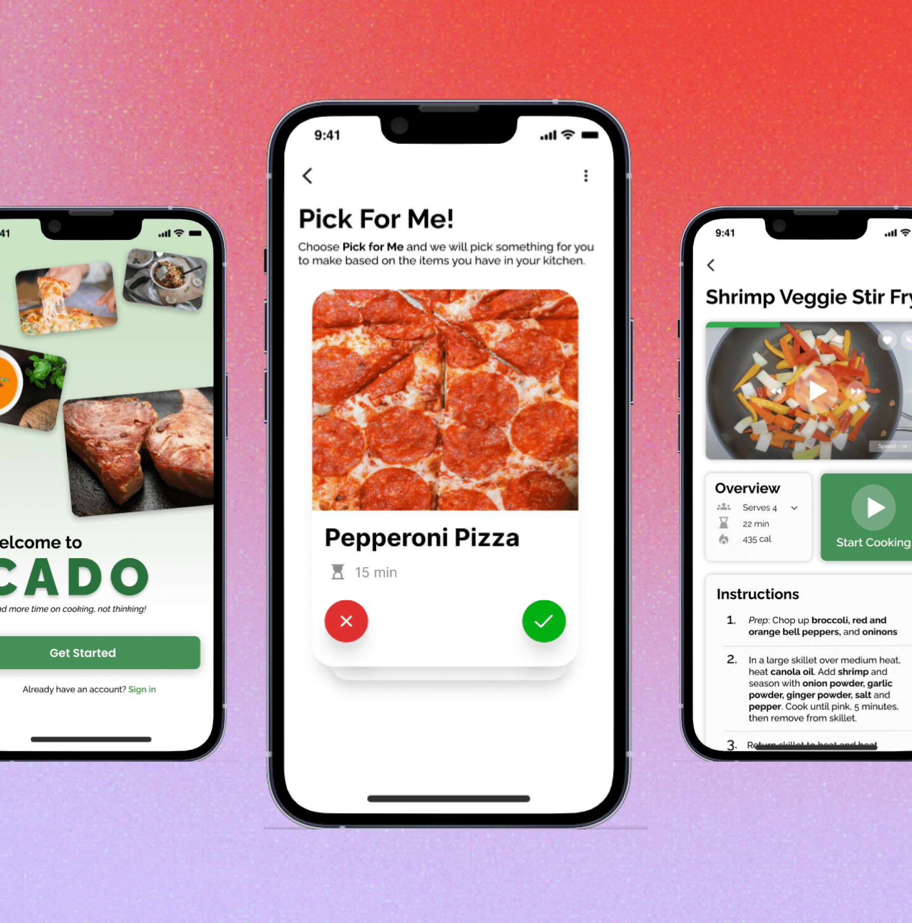
Final Product:
Overview
This project was completed as one of the projects for the Google UX Design certificate program. Based on the research conducted and findings I concluded, I designed an app that decides what the user can make with the ingredients already at home. The goal of this project was to eliminate the deciding time involved in making a meal, and spend more time actually making the dish.
My process
I followed the Interaction Design Foundation's Design Thinking process when working on this project.
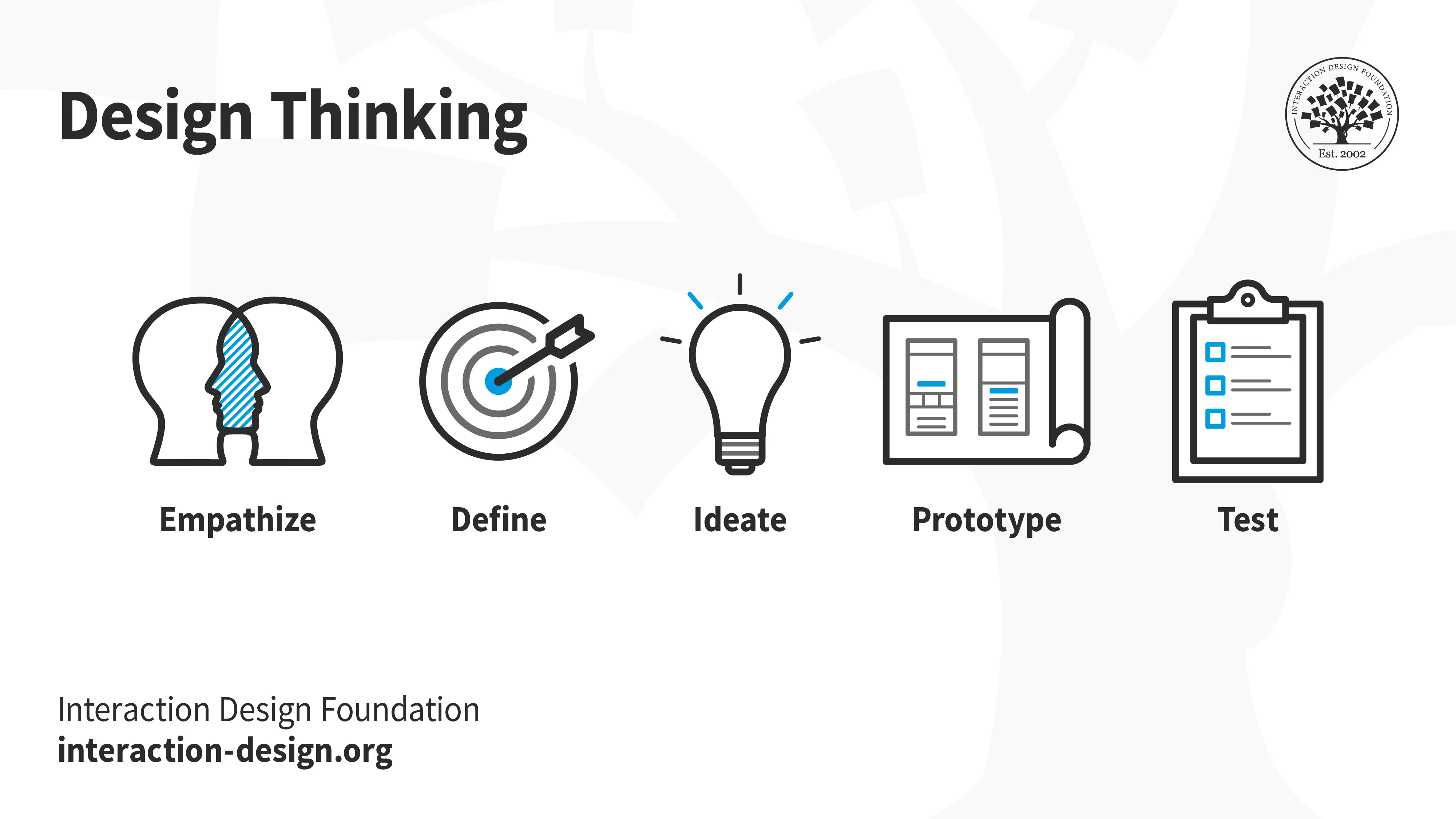
🔎 Stage 1: Empathize—Research Your Users' Needs
User Interviews (1st round)
The purpose of speaking to individuals before designing is to understand how this problem impacts them in an everyday schedule even though they all have different lifestyles. Here is the criteria of who I spoke to:
N = 5
Ages: 18 - 37 years old
Employed Full Time, 9-5pm work schedules
Diverse living arrangements (i.e. living solo, with children, roommates, etc.)
The objective of this phase of interviews was to primarily understand:
How they determine their meal choices
Where they seek motivation
If they experience any present frustrations with their mode of decision-making.
Affinity Mapping on FigJam
This is where I organized all the users quotes and special findings to use for my project.
(Click the image to access the FigJam file)
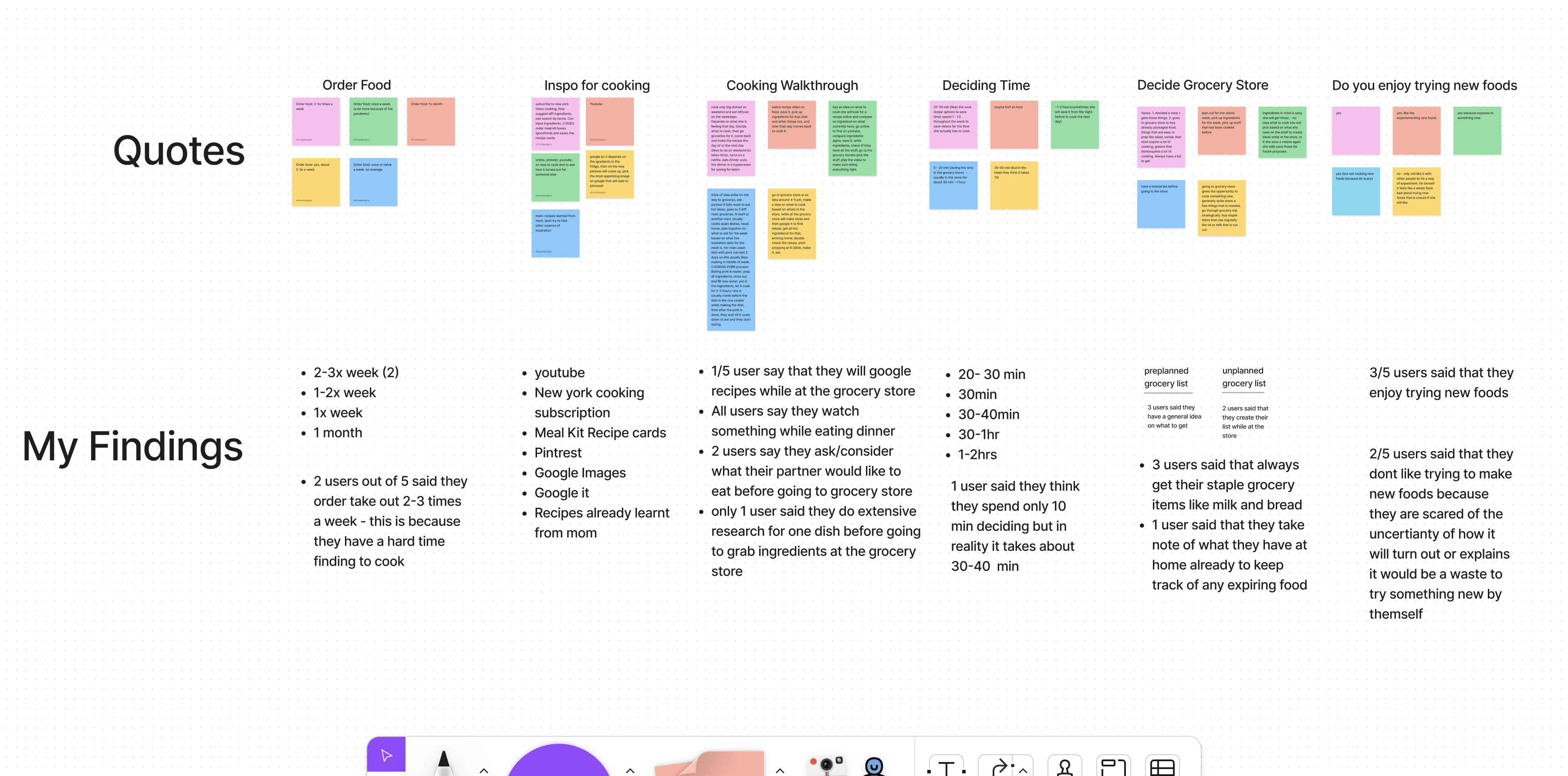
"When I come home from work, the last thing I want to do is spend too much time deciding what to make for dinner." - Participant #2
Competitive Analysis: What are the others doing?
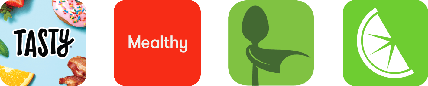
I investigated various recipe apps to identify any gaps I could potentially address. The primary competitors include: Tasty, Mealthy, Supercook, and Mealime.
Competitive Analysis Report
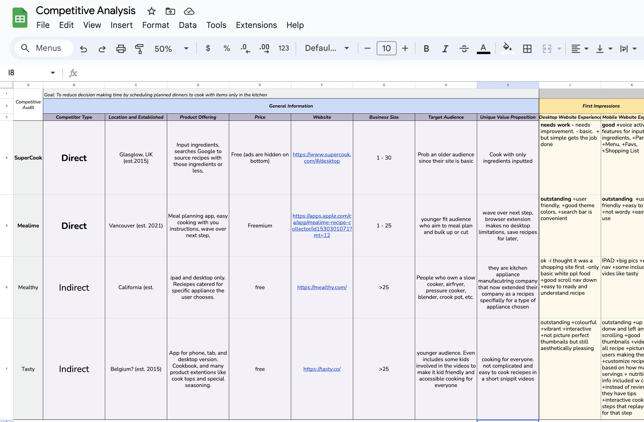
I thoroughly went through each direct and indirect competitor to see what they are currently offer. I used this information to figure out where the gaps are to use that for my CADO app.
The 4 main insights I gathered from User Interviews AND Competitive Analysis:
Indecisive - Too many options make users more confused
Expensive - Users spend too much money on food delivery apps because its convenient.
Dont have the ingredients - Not all ingredients are accessible.
Dont have time to make meals.
🤔 Stage 2: Define—State Your Users' Needs and Problems
What is the problem?
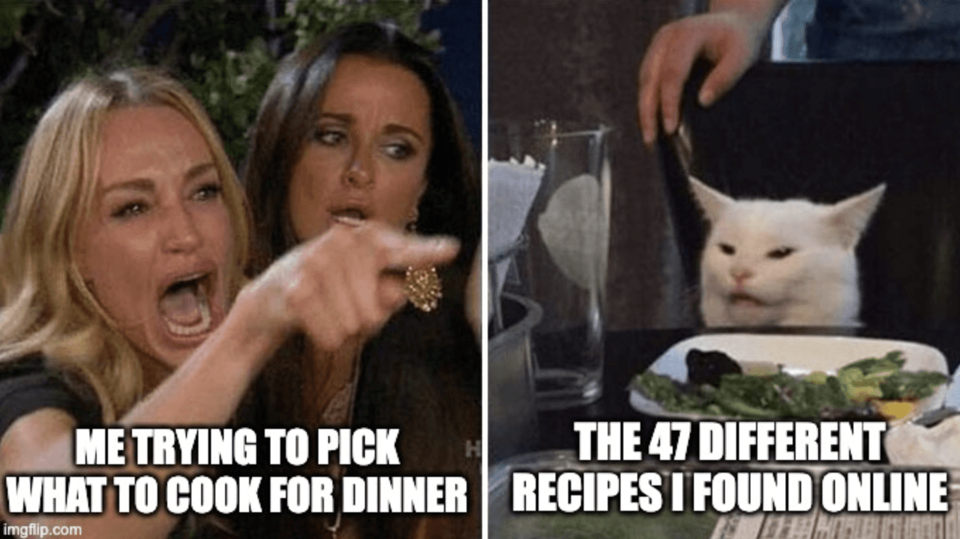
Wasting excessive time choosing what to create, rather than creating it.
Selecting a dish to prepare can be both daunting and exhausting, particularly when you're famished and would rather not waste time making a decision.
Countless hours may be spent perusing a never-ending assortment of online recipes, only to realize that your kitchen lacks half of the required ingredients.
Okay so,
How might we reduce deciding time by only offering cooking videos that can be made with the ingredients in your kitchen?
💡 Stage 3: Ideate—Challenge Assumptions and Create Ideas
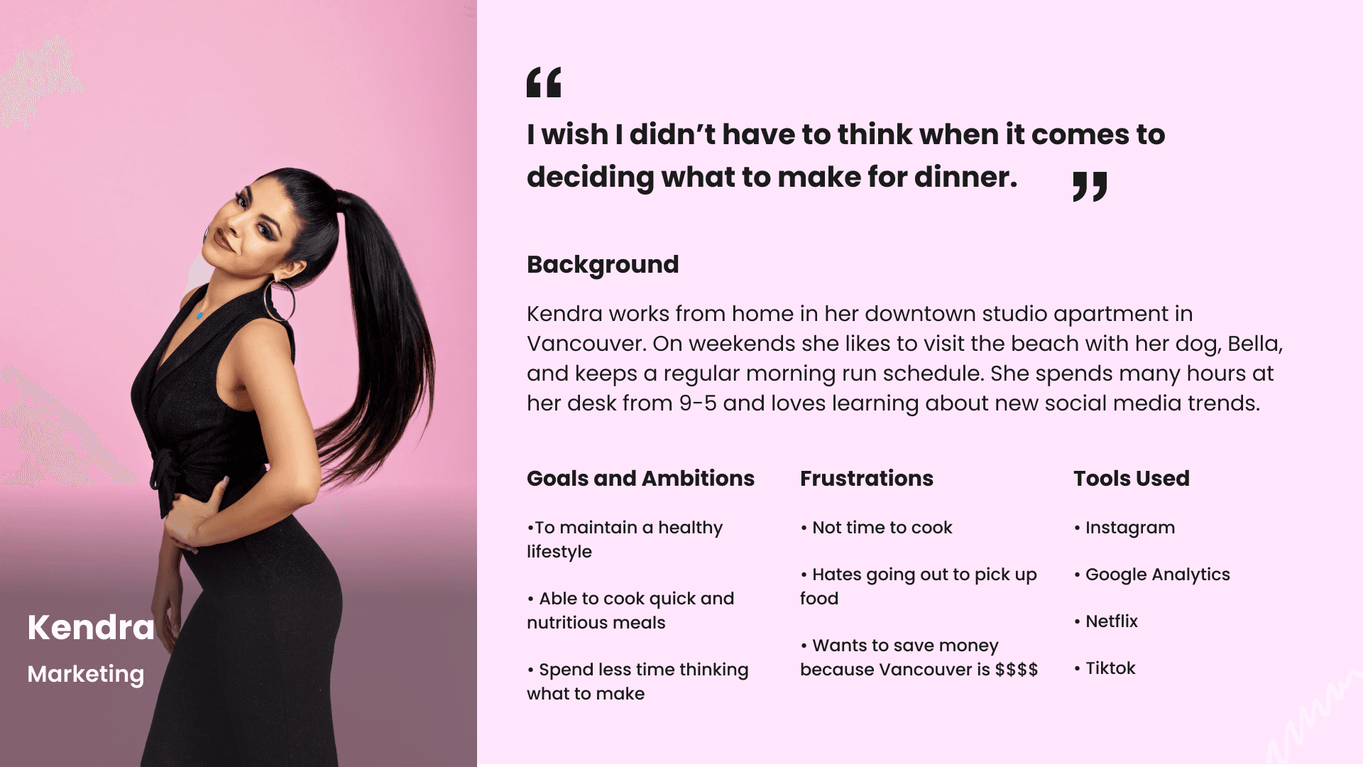
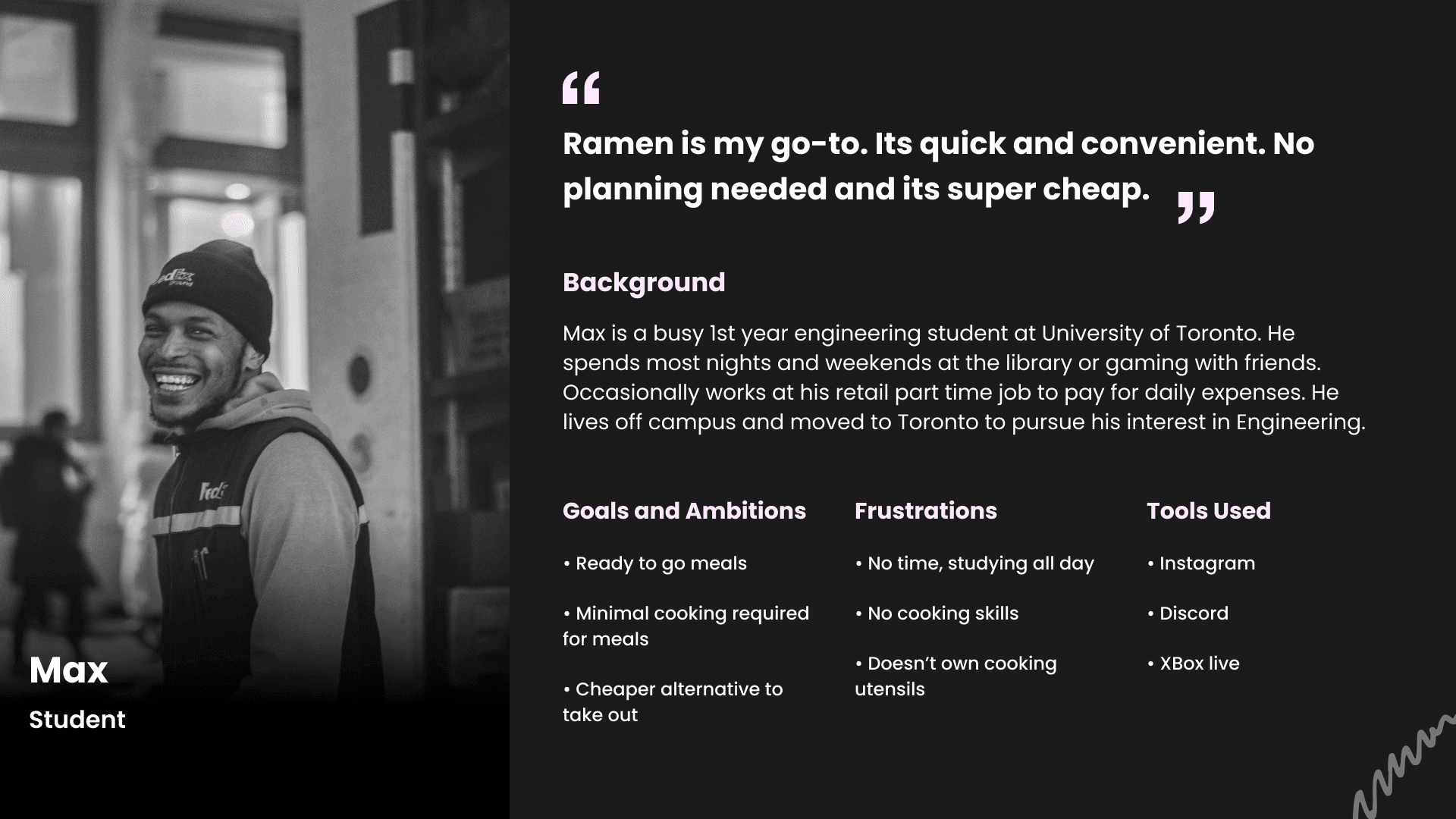
Following the interviews and conducting an in-depth competition study, I developed two distinct Personas -
Primary - Kendra
Secondary - Max
Both represent 2 user groups facing similar challenges in meal preparation.
Storyboards
This storyboard is designed to showcase the narrative of a user experiencing a challenge before the development of the intended application, in a swift and impactful way.
The persona represents the viewpoint of the user, Kendra, who struggles to create something after work hours due to exhaustion and ultimately opts for a more convenient option: ordering dinner from a food delivery app, even if her financial situation doesn't allow for it.
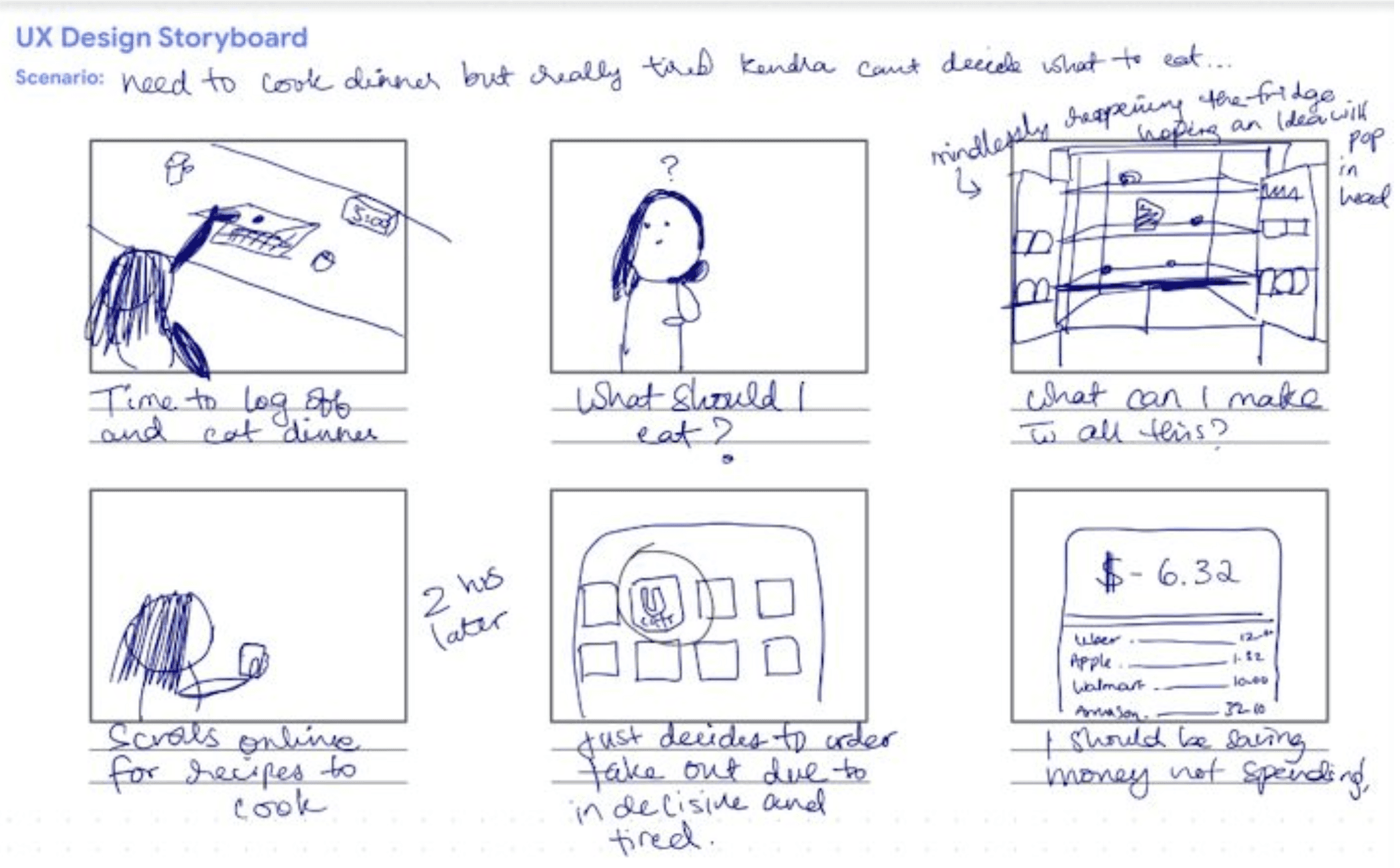
(I promise I can draw better than this. Check out my work here)
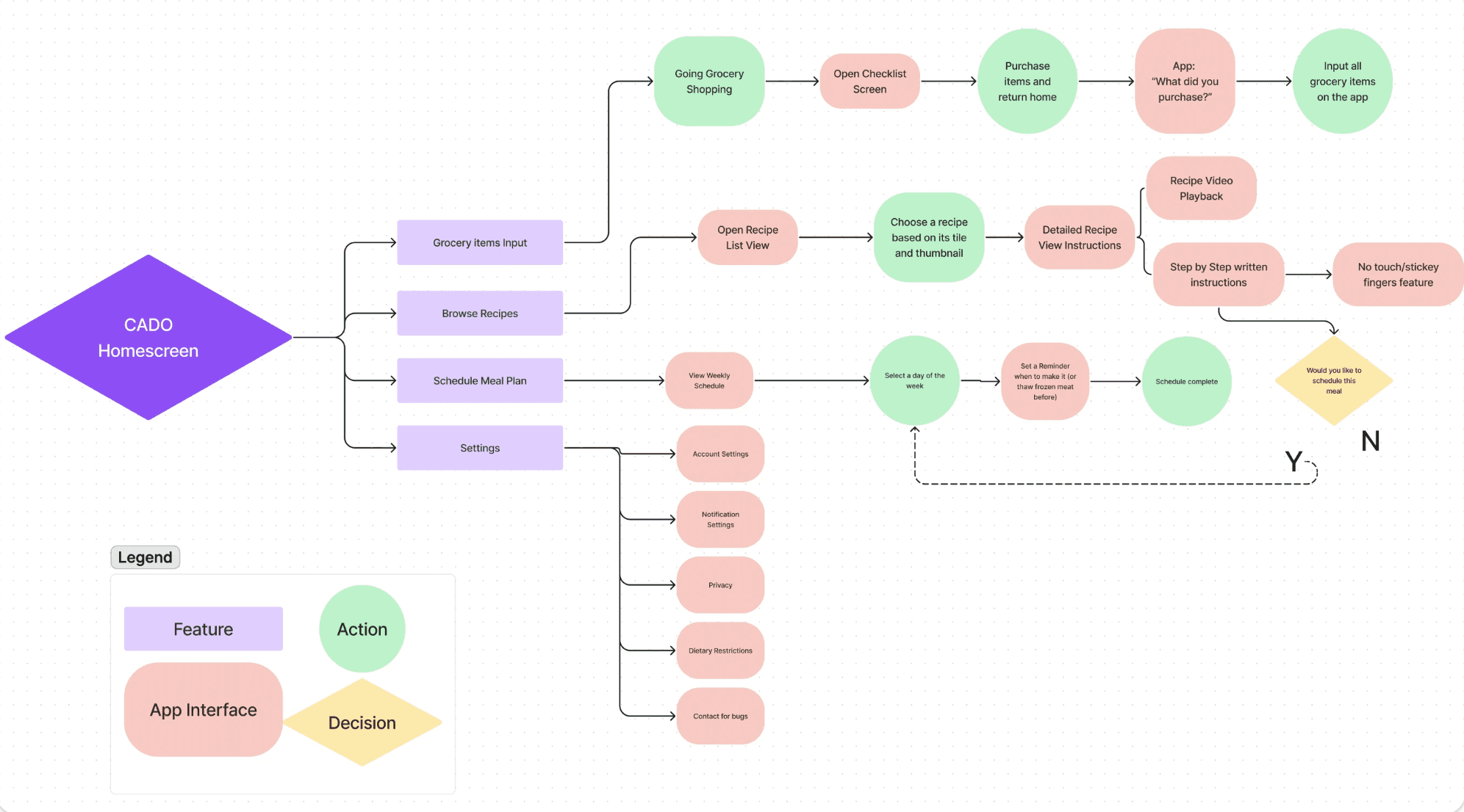
Lets create a User Flow
Next, I created a more organized user flow comprising the 4 main features I plan to include:
1. Grocery Entry (where users input all the grocery items they bought)
2. Recipe Exploration (Browsing through options)
3. Meal Plan Arrangement (Create meal plans for the week)
4. Preferences (Dietary restrictions)
The user flow illustrates how users will interact with the app through specific actions needed to effectively navigate a flow. Shape identifiers are situated at the lower left of the screen.
This activity allowed me to understand user engagements with the app/feature. Through this method, I realized the numerous steps involved in conducting fundamental tasks, such as Inputting Groceries.
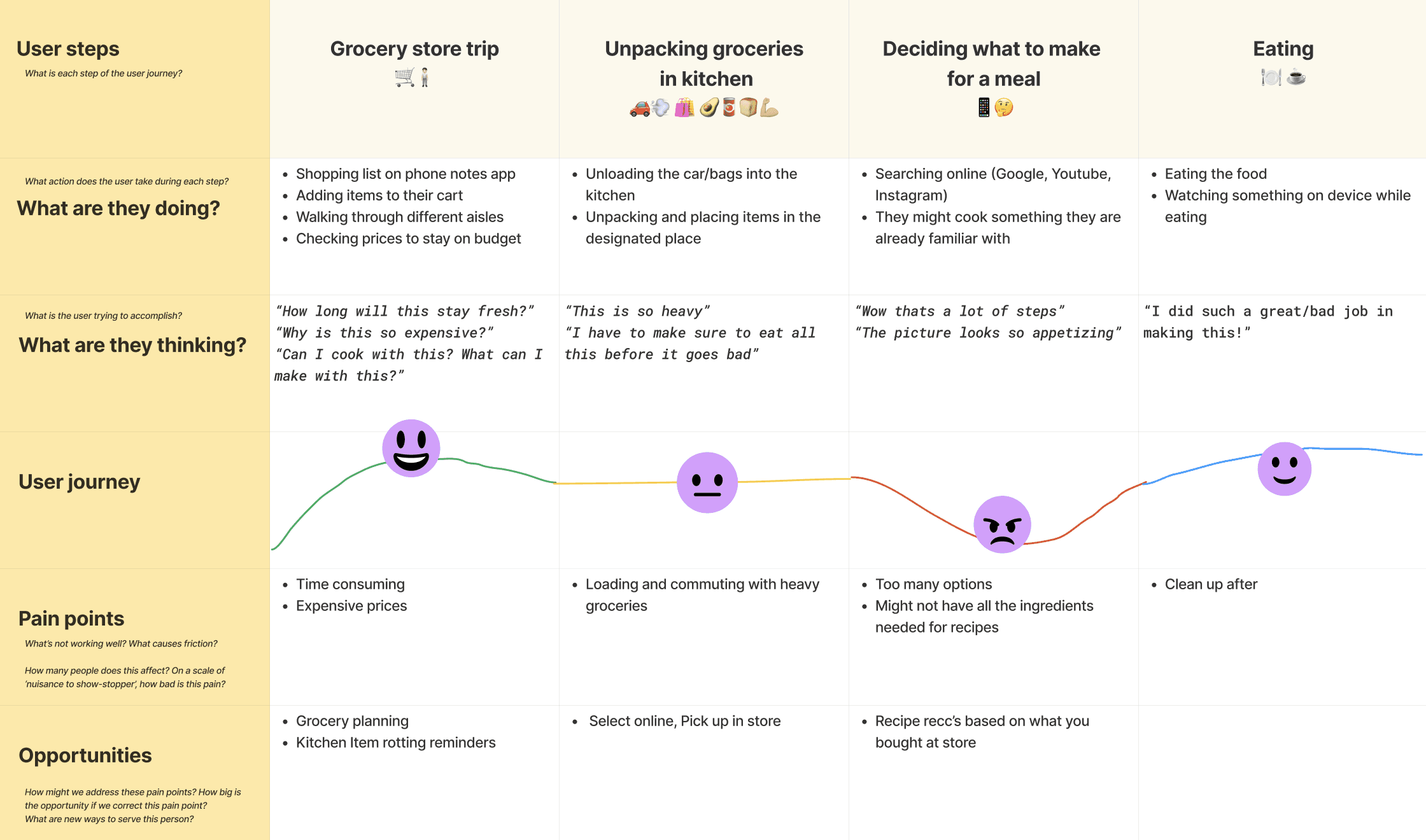
Lets create a User Journey Map
I developed a User Journey map illustrating a comprehensive perspective on the user's experience of visiting the grocery store, unloading purchased items, preparing a meal, and ultimately enjoying it.
This was meant to gain insight into how users manage their current issue prior to app development.
My goal was to identify moments of frustration and delight throughout the various stages.
Main source of frustration: during meal planning.
Main source of happiness: while consuming the food.
✍🏽 Stage 4: Prototype—Start to Create Solutions
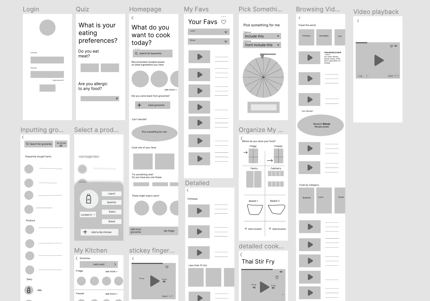
Wireframe sketches
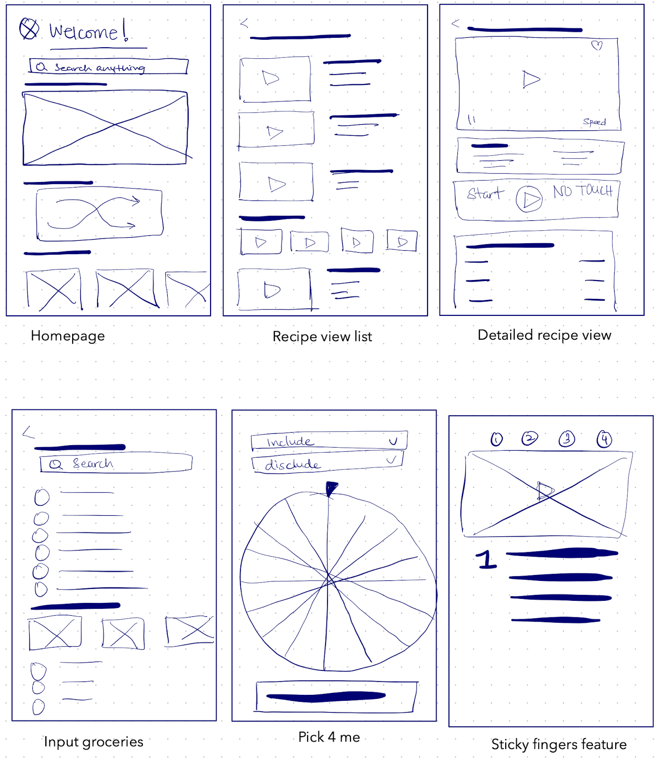
Low-fidelity wireframes
I also created a mood board which you can check out here :)
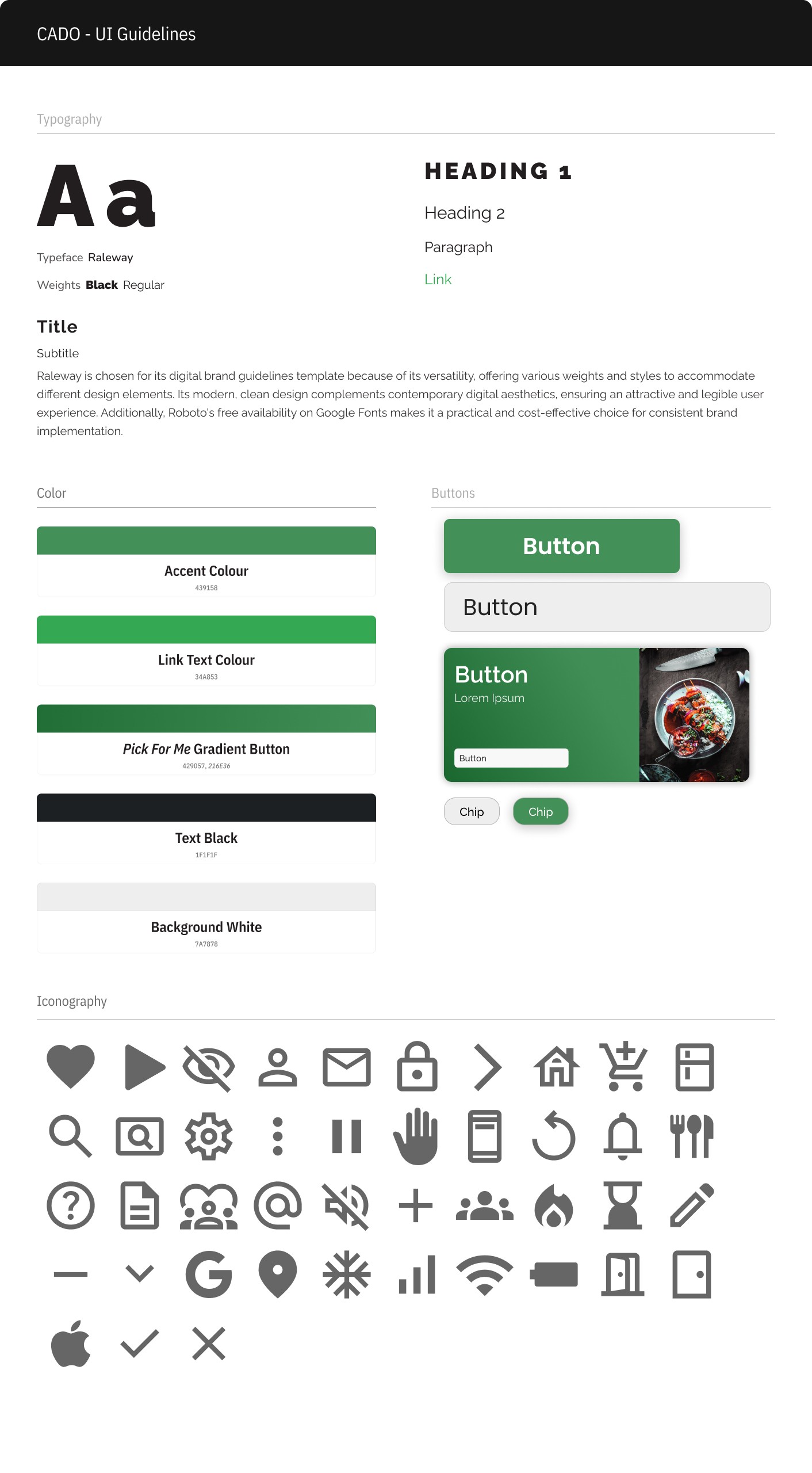
Visual UI Guidelines
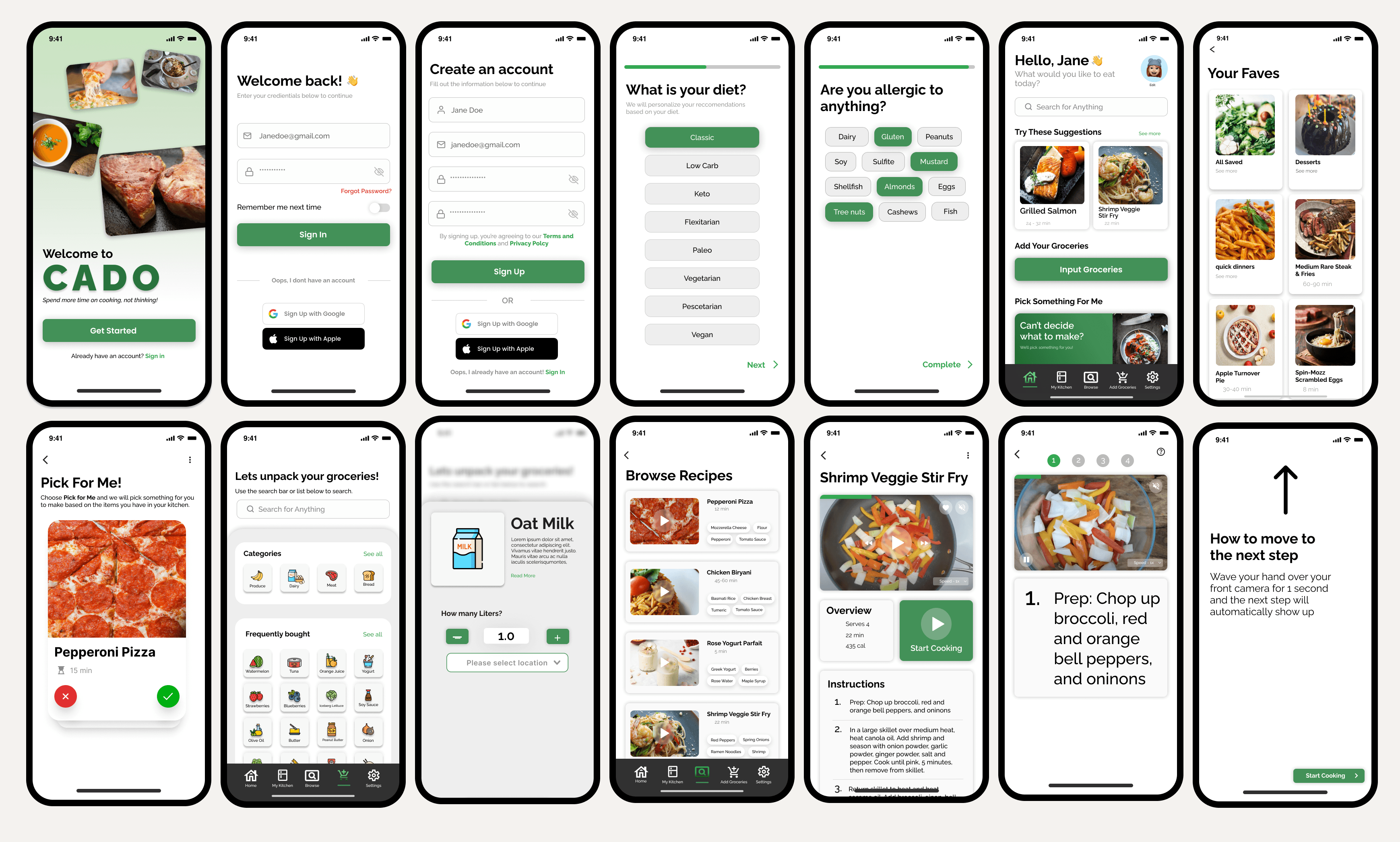
High Fidelity Wireframes
🔎 Stage 5: Test—Try Your Solutions Out
Once I believed I had completed this product, I conducted Usability Testing with the same 5 individuals I had interviewed initially for this project. The primary objective of this phase was to identify any additional modifications and enhance the UX and UI of the Cado App.
Below you'll find all the adjustments I made after conducting the 2nd round of testing
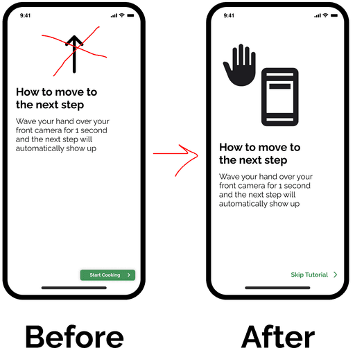
Incorporate an enhanced image to demonstrate how to use the Sticky Fingers Feature
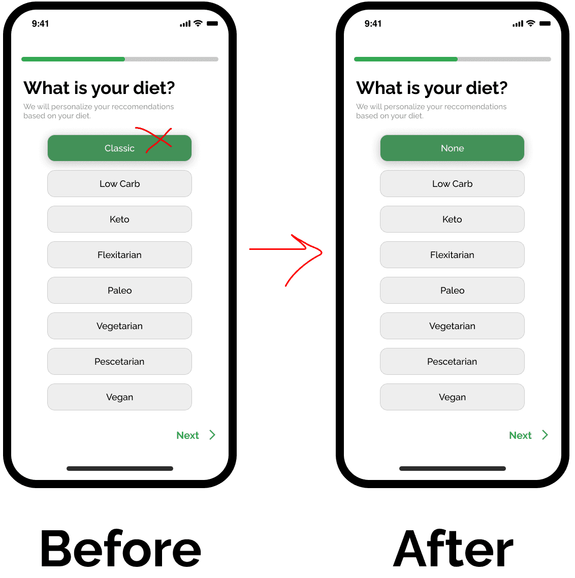
Changed "Classic" to "None" since some users misunderstood the classic term
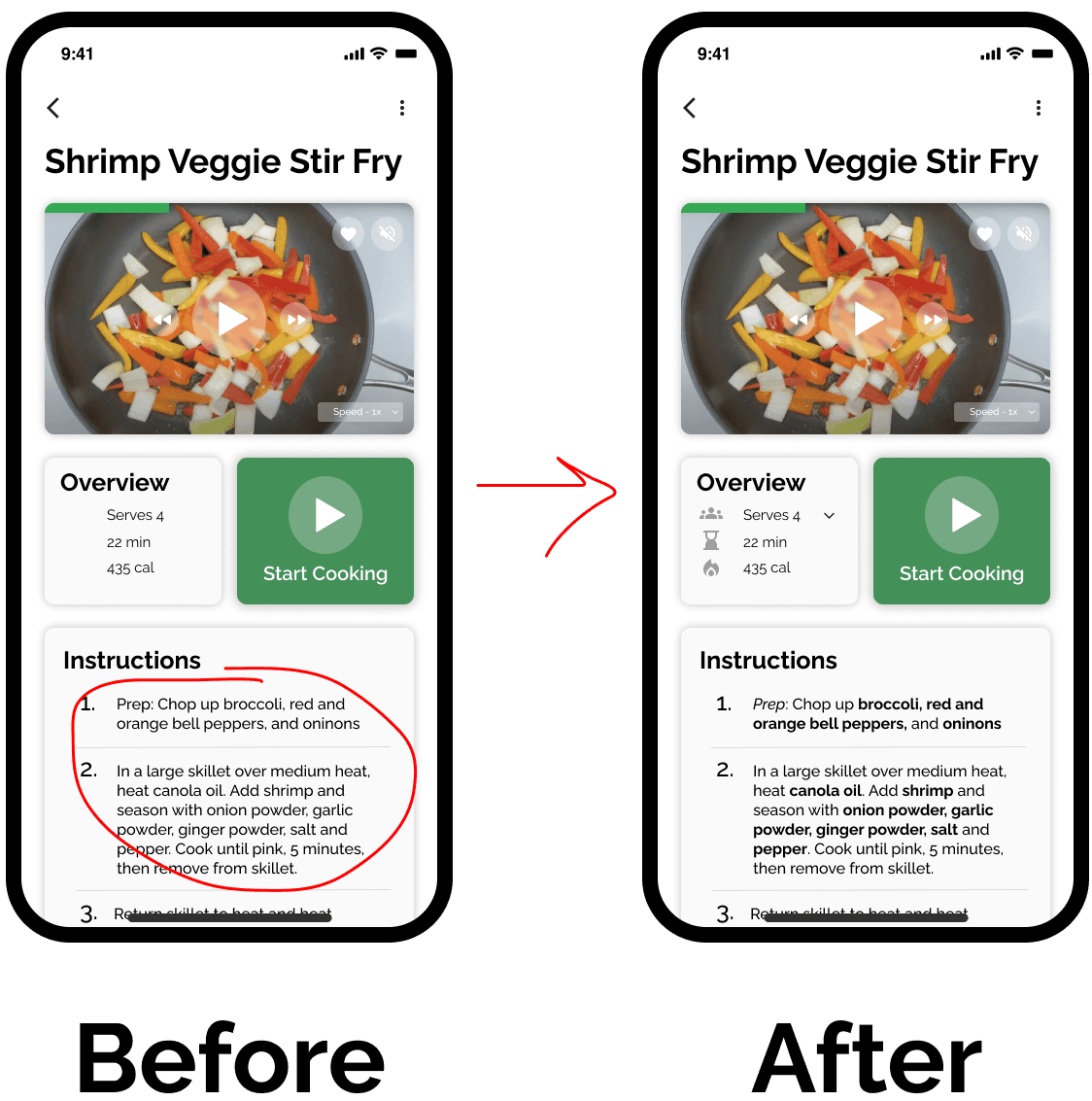
For ease of readability, I bolded all the ingredients in the recipe.
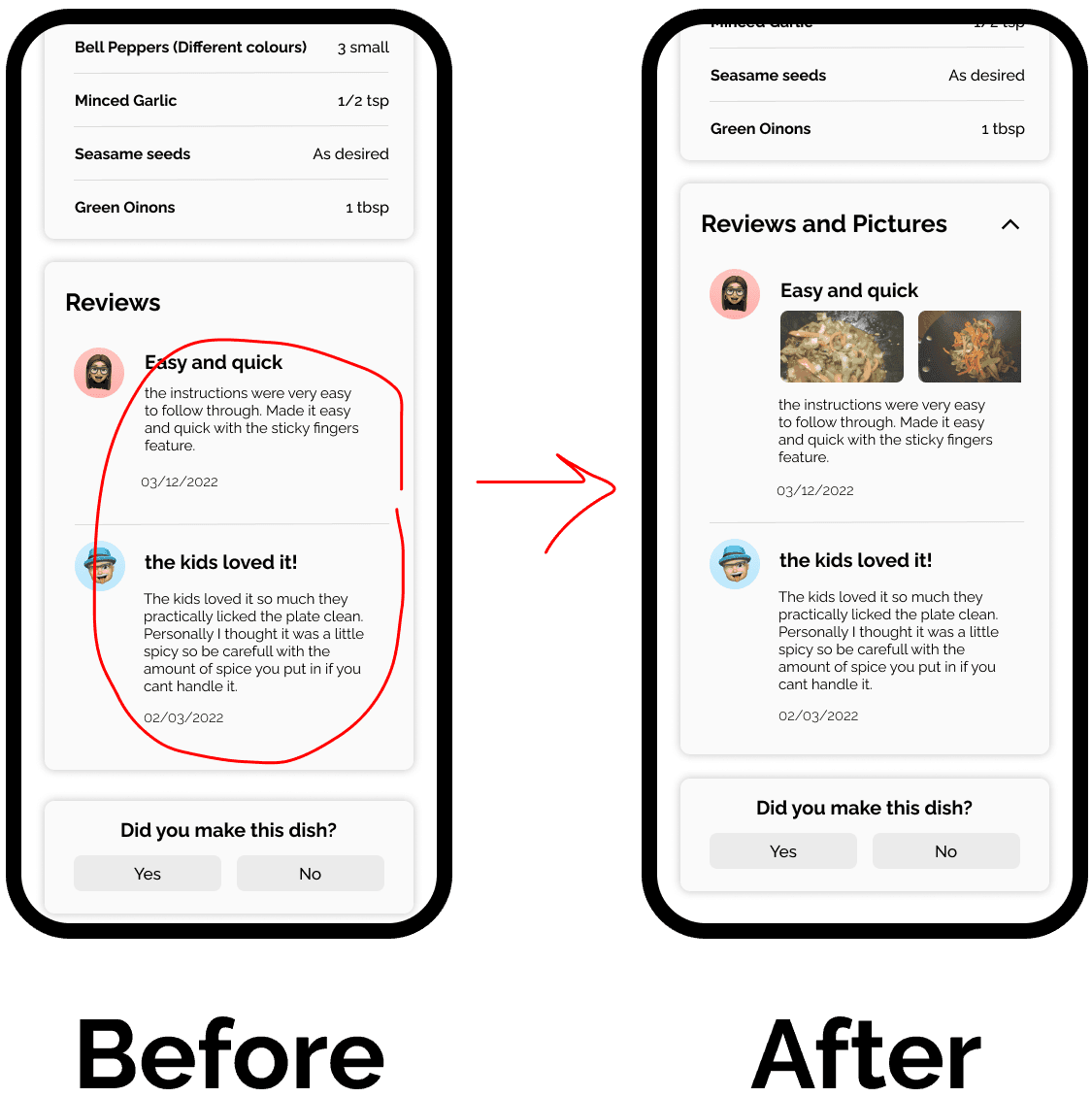
3/5 users asked for pictures with reviews, similar to Amazon reviews section
✅ You can try out the final prototype here :)
or check out this promotional video below!
Key takeaways
It's okay to ask for help - During the creation of this project, I discovered that reaching out to experienced designers could have been a significant time-saver. Getting expert advice would have helped me make decisions more efficiently after the research phase of designing the entire app.
Thanks for reading my case study :)