
Method CRM
UX Design, UX Research
TL;DR:
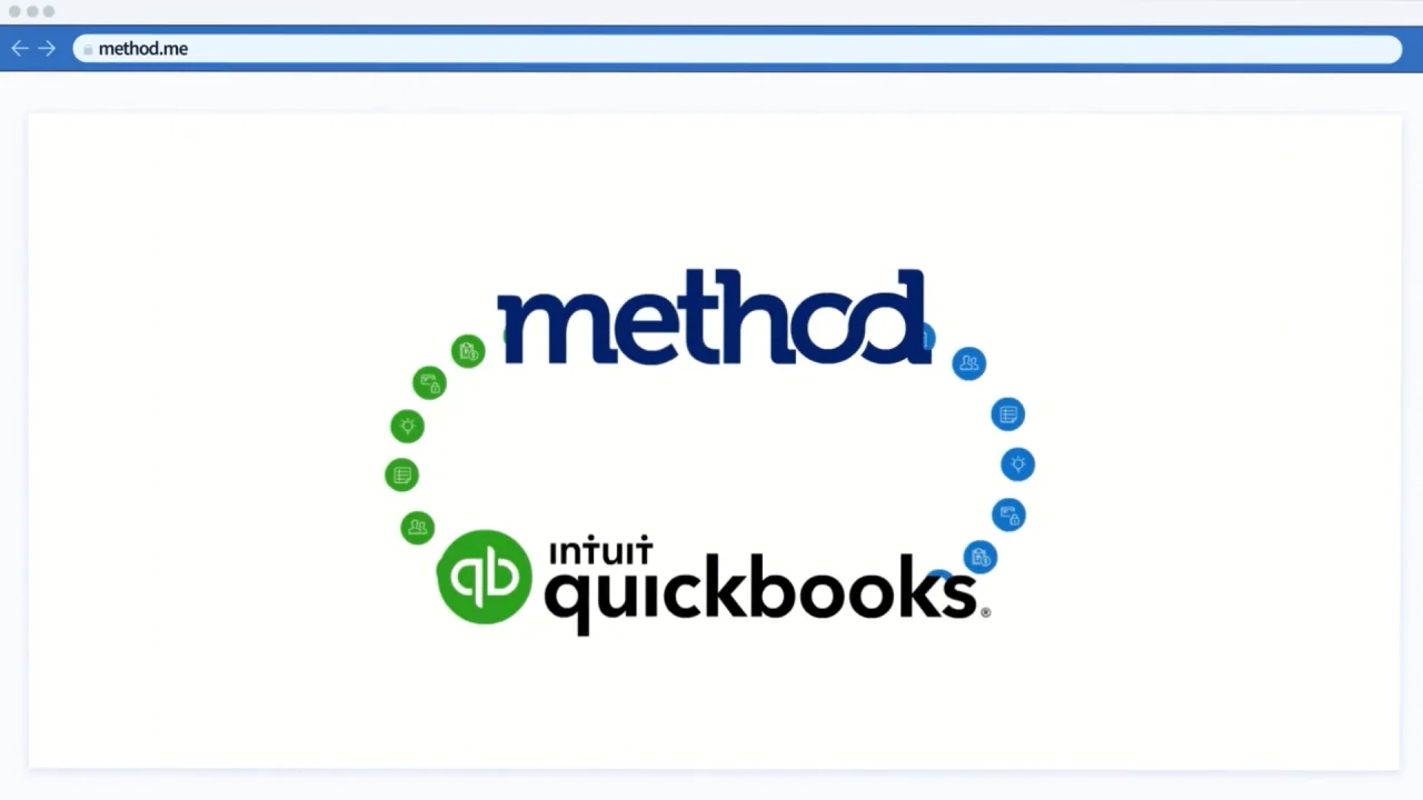
At Method:CRM, a CRM platform enhancing accounting tools like QuickBooks and Xero, I tackled the challenge of making deposit toggles easily discoverable.
The result was a redesign on the settings page and that decreased the number of support tickets by 44%
What is Method CRM?:
Method:CRM isn’t just another accounting software; it's your business's best friend. It steps in where QuickBooks and Xero step out, focusing on the customer relationship. Whether it's creating estimates, collecting payments, or simply managing potential sales, Method:CRM ensures you're building your business, not just running it. With features like two-way real-time syncing, online portals for customers, and streamlining workflows, the platform is designed to supercharge customer relationships and offer seamless business operations.
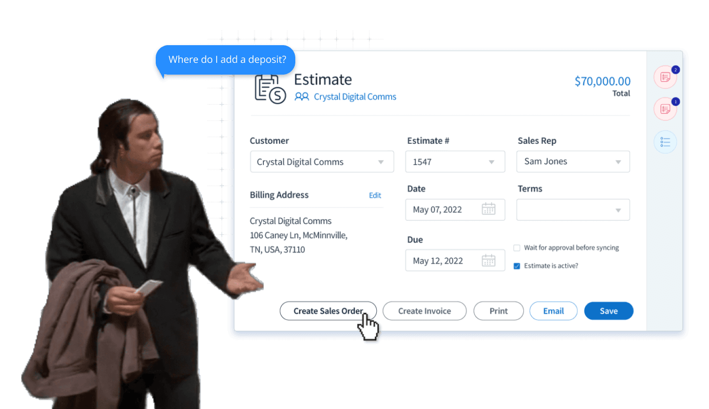
The Problem
Support tickets were flooding in. Users were struggling with the deposit toggle within the Estimates app, making it a pressing concern for Sales Managers using the CRM platform.
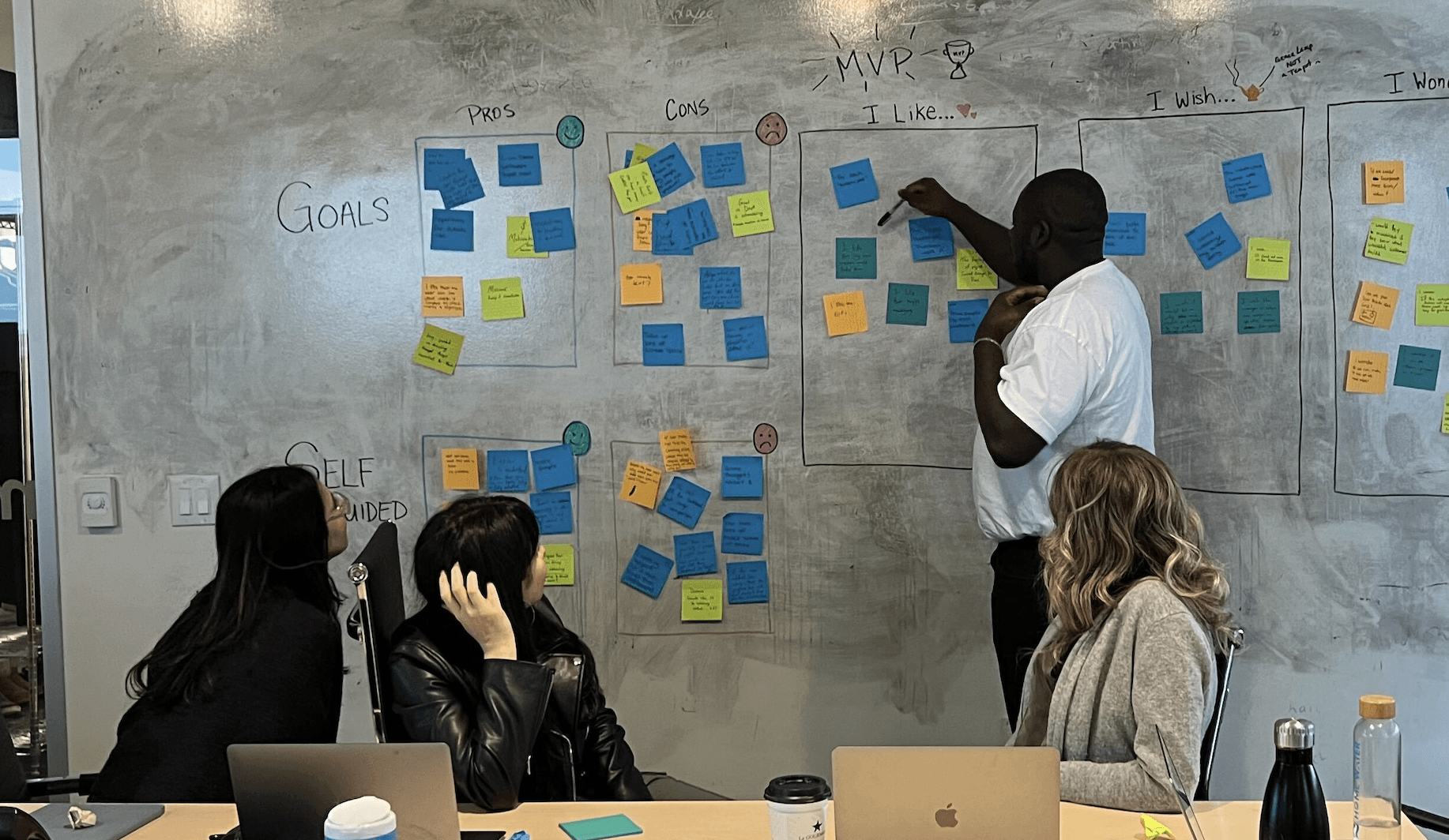
The Team:
Working alongside 1 Product Manager, 2 developers, and stepping in as a Product Designer, we set out to tackle this challenge head-on. Starting off with brainstorming sessions, we set out to understand what the competitors are doing, and how we can capitalize on them.
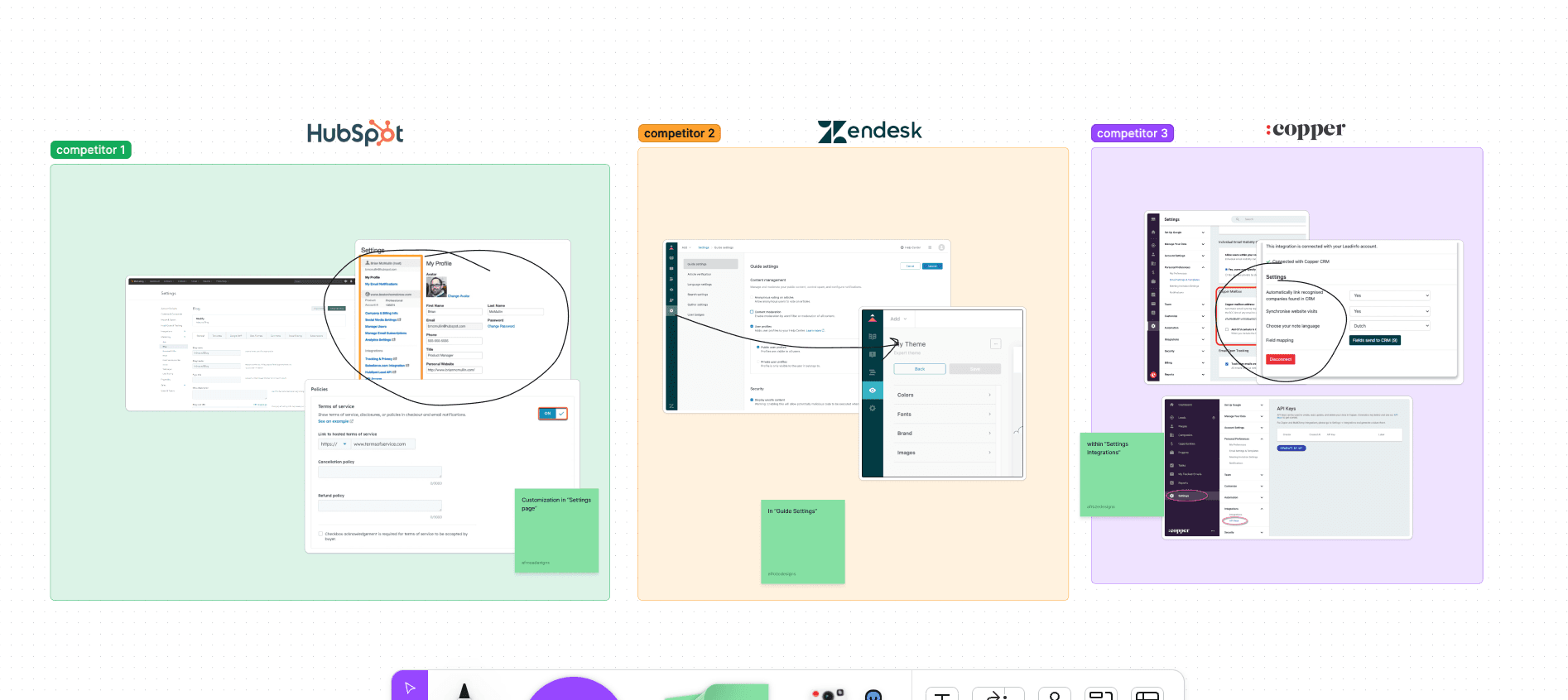
Research:
We started the project with a comprehensive competitive analysis, user interviews, and using Hotjar heatmaps. These activities shed light on the areas that required urgent attention. The following is the insights we found:
Heatmaps - Users always clicked back to settings to alter Estimate view
Competitor Analysis - Users are able to customize via the settings / customizations page
It became apparent that users struggled with locating the deposit toggle, a valuable functionality within the Estimates app. This challenge highlighted the need for a broader redesign of the Settings page.
Design:
Navigating the constraints of a no-code platform was like trying to solve a puzzle with some pieces missing. We went through three design iterations. Each was influenced by factors like responsiveness, platform limitations, and accessibility standards.
Low Fidelity Designs:
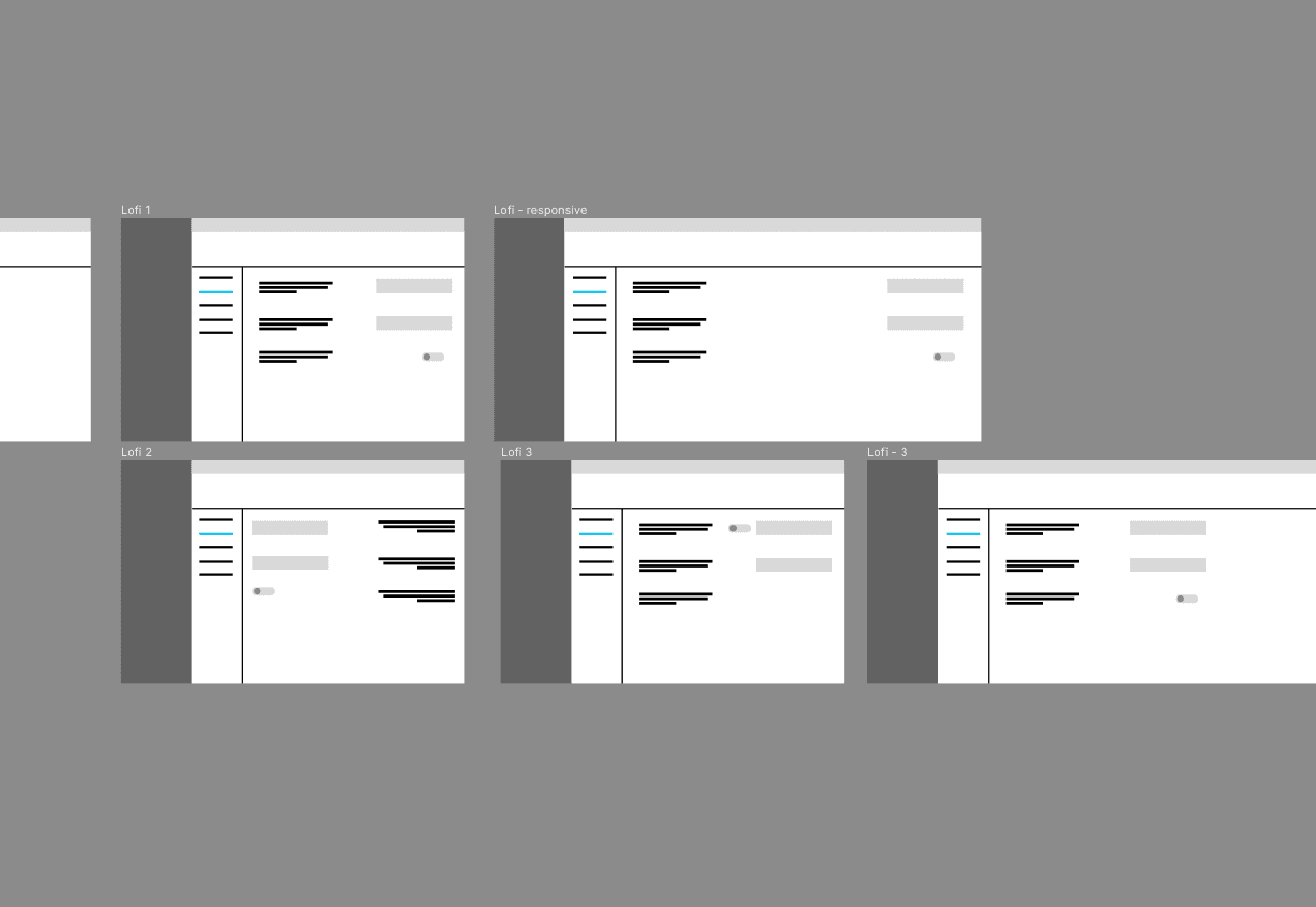
After close collaboration with the no-code developer to understand the platform's capabilities, I crafted the high-fidelty designs that met both user needs and the platform's constraints.
Below are the High Fidelity designs used in User testing.
High Fidelity Designs:

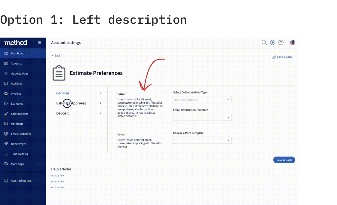
User Testing:
We brought in five team members for user testing to determine where is a more natural placement of the text associate for each drop down menu.
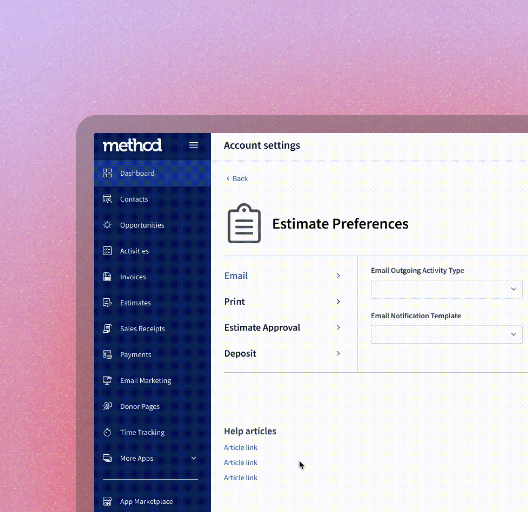
Final Design:
With constraints and user feedback in mind, we revamped the Preferences screen of the Estimates app. Our primary goal was to make it user-friendly, ensuring the deposit toggle was easily accessible.
[Image: Place the 'Before' visual on the left and the 'After' visual on the right, showing the transformation clearly.]
Challenges & Overcoming Them:
The primary challenge was the no-code platform's limitations. But, instead of seeing them as obstacles, I viewed them as opportunities for innovation. Engaging with developers early on would have provided a clearer understanding of these limitations, a lesson I took to heart for future projects.
Key Takeaways:
Innovation Within Limits: This project emphasized the importance of embracing design limitations. Constraints, when approached right, can be the birthplace of innovation.
Balancing User Needs & Business Goals: An essential aspect of design is striking the right balance. Advocating for users while understanding the business's needs became evident when deciding on UI element placements.
Collaboration Is Key: Establishing open communication channels with developers early on can save a lot of design iteration time. This project reinforced the value of interdisciplinary collaboration.